Black countertops have long been associated with modern luxury. They look bold, dramatic, and instantly elevate a space visually. But when it comes to Vastu Shastra, black is a colour that deserves a second thought—especially for surfaces that are used every single day, like kitchen and bathroom countertops. At Specta, we often see homeowners drawn to black for its aesthetic appeal, only to later realise that it may not align with the energy they want their home to carry. The good news? You don’t have to compromise on design to follow Vastu. Thoughtfully chosen coloured countertops can bring both balance and beauty into your space.
Why Countertop Colour Matters in Vastu
In Vastu, colour plays a powerful role in influencing the energy of a home. Countertops occupy large visual areas and are constant points of interaction, which makes their colour especially significant. Black is considered a heavy, absorbing shade. While it works well as an accent, Vastu often discourages its extensive use in areas connected to nourishment, hygiene, and daily routines. Over time, dominant black surfaces may contribute to a sense of stagnation or imbalance.
This is why Vastu experts usually recommend lighter, warmer, or earth-inspired colours for countertops. Such shades promote flow, clarity, and positivity.
Black Countertops in the Kitchen: A Common Vastu Concern
The kitchen is governed by the fire element, which thrives on warmth, brightness, and movement. Black, symbolically linked to darkness and water, can disrupt this balance when used heavily.
From a practical standpoint, black kitchen countertops also tend to show oil splashes, water stains, and dust more easily—something most Indian kitchens experience daily. This often leads to higher maintenance and visual clutter. Coloured quartz surfaces, on the other hand, offer a softer presence while still looking refined and contemporary.
Better Vastu-Friendly Alternatives from Specta
Specta’s quartz collections are designed to help homeowners strike the right balance between design, durability, and Vastu sensibility.
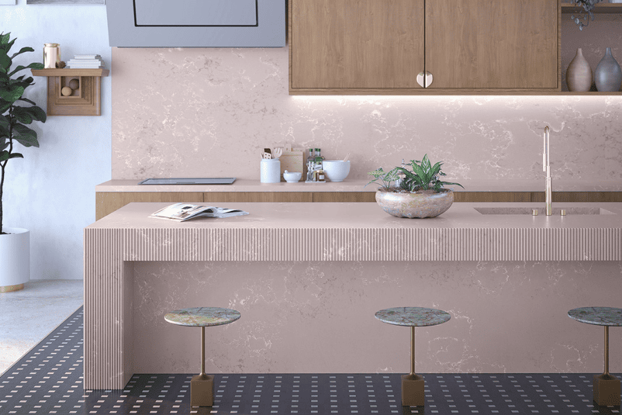
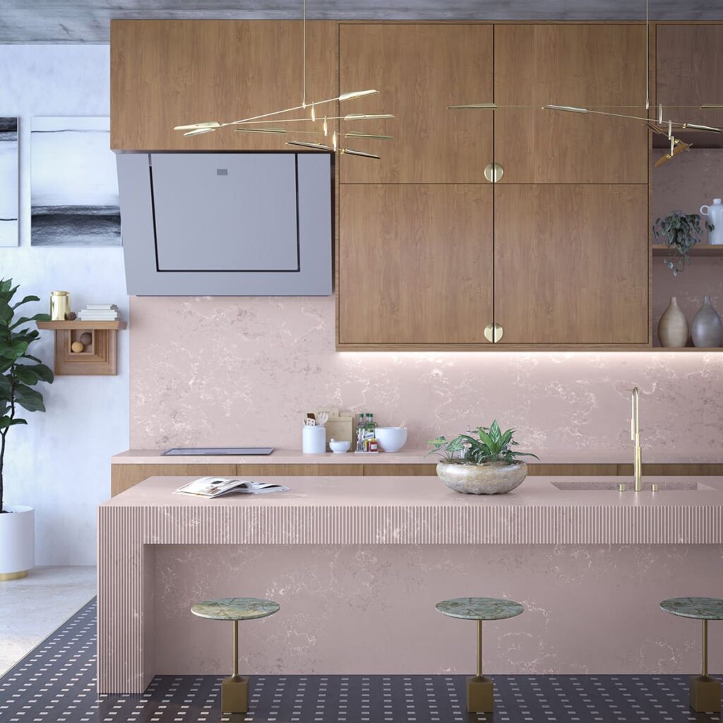
- Pastel Poise Collection: Ideal for kitchens, this range features soft, calming hues that support positive energy. These shades, such as mint green, pink, and pastel blue, work beautifully in spaces where you want lightness without stark whiteness.
- Lustre Red: Warm and energising, Lustre Red is well suited for kitchens where stimulating appetite and activity is important. Used thoughtfully, it aligns well with the Fire element.
- Sawai Emperador: For those who prefer earthy richness without the heaviness of black, Sawai Emperador offers depth with warmth. It brings grounding energy and pairs well with wood finishes.
- Tunis Fog: A subtle neutral that sits comfortably between grey and beige, Tunis Fog is a versatile choice for both kitchens and bathrooms. It promotes calmness while maintaining a modern look.
These colours allow your countertops to feel intentional, balanced, and visually inviting without overwhelming the space.
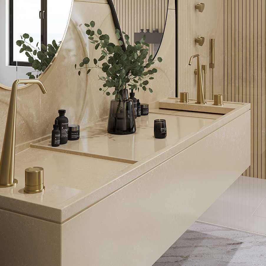
Bathrooms and Utility Areas
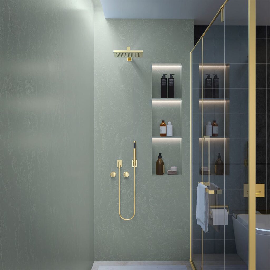
Bathrooms and utility areas already deal with water flow and drainage. According to Vastu, using very dark colours in these spaces can intensify heaviness.
Specta’s lighter quartz options work exceptionally well here. Soft neutrals and gentle pastels reflect light, make spaces feel cleaner, and support smoother energy circulation. They also have the added benefit of making compact bathrooms look more open and airy.
Modern Living Is Moving Beyond Black
Design trends are gradually shifting away from stark contrasts toward softer, more enduring palettes. Homeowners today are looking for surfaces that feel welcoming, age well, and support overall wellbeing.
Specta’s quartz surfaces are non-porous, low-maintenance, and engineered for Indian homes. They resist stains, scratches, and heat, making them practical choices for everyday use—while also supporting Vastu-aligned colour preferences.
Balance Is the Key
Vastu doesn’t demand rigid rules—it encourages balance. If you love black, it can still be introduced in small accents, trims, or hardware. But for large, functional surfaces like countertops, choosing lighter or warmer tones creates a healthier, more harmonious environment.
By opting for thoughtfully coloured quartz from Specta, homeowners can enjoy contemporary design without compromising on comfort, positivity, or peace of mind.

