
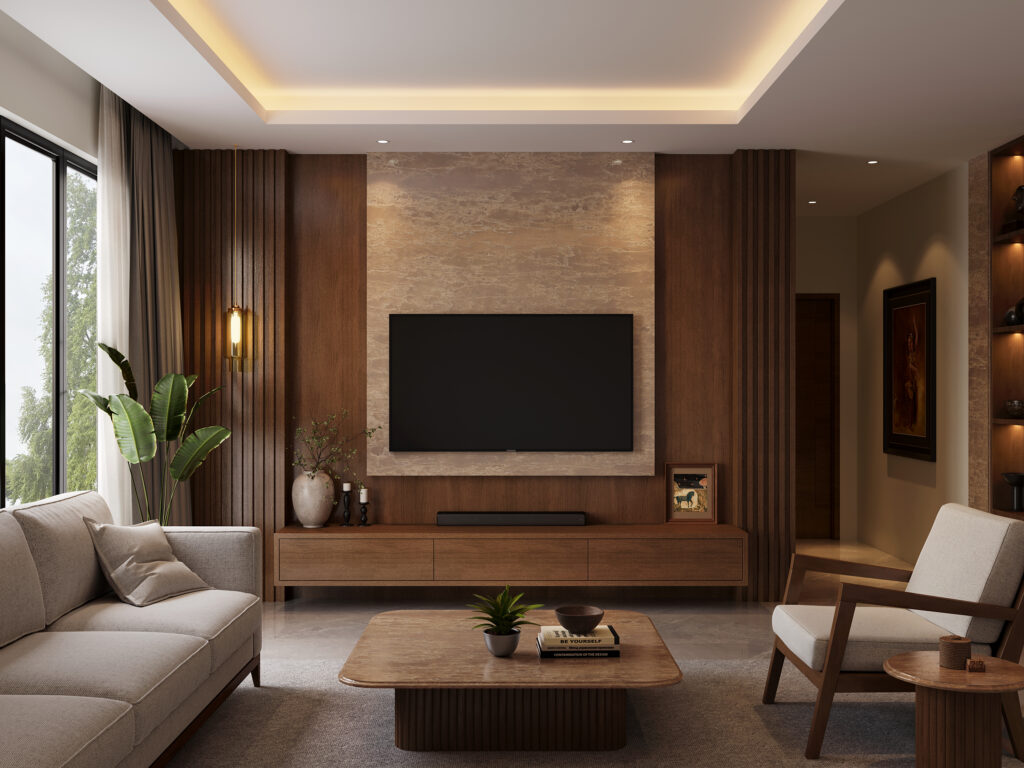
Neutrals have always been a safe choice for home interiors. Whites, creams, greys and beiges can make a space feel clean and timeless, but there is a new shift happening in the way we use them. Today, homeowners are moving towards warmer, more nature-inspired neutrals that bring a little more personality into the room.
Think sandy beige, warm ivory, muted browns, clay, taupe and stone-inspired shades. These earthy tones are becoming the new neutrals because they offer the same versatility as traditional neutrals, but with more warmth and depth.
Why Are Earthy Tones Having a Moment?
There is something naturally calming about colours inspired by the outdoors. Earthy shades tend to feel softer and more lived-in than stark whites or cool greys. They can also work across different interior styles, from contemporary and minimalist spaces to homes that use more traditional materials and details.
Another reason they work so well is that they are easy to layer. You don’t have to commit to one particular colour across an entire room. Instead, different shades from the same family can come together to create an interior that feels cohesive without looking too coordinated.
For example, a warm cream can sit comfortably alongside:
- Light and dark wood tones
- Natural fabrics and textured upholstery
- Greenery and indoor plants
- Black, brass or other understated accents
The result is a space that feels warm without becoming visually busy.
It’s Not Just About Beige
When we talk about earthy interiors, beige is only one part of the story. The trend is really about exploring the full spectrum of colours found in nature.
Soft creams, warm taupes, muted browns, sandy tones and subtle terracotta can all act as neutrals depending on how they are used. Even slightly deeper shades can work beautifully when balanced with lighter colours and plenty of natural light.
The trick is to avoid making everything the same shade. Instead, introduce small variations in colour, texture and finish. This creates visual depth while keeping the overall look understated.
Let Your Surfaces Join the Colour Story
While furniture and fabrics are usually the first things we think about when introducing colour, larger architectural surfaces can make an equally strong impact.
Kitchen islands, living room walls, and backsplashes, for instance, occupy a substantial amount of visual space. Choosing a surface in a warm, earthy tone can give the room character without requiring dramatic colours or elaborate décor.
At Specta, the Krest Collection takes inspiration directly from nature. Its aesthetic draws from the textures, tones and geological formations of the natural world, with shades such as White Dune, Oyster Glaze, Topaz Valley and Golden Morraine, among others. Designed using advanced technology, Krest slabs offer the versatility to extend these design elements beyond horizontal surfaces, making them suitable for vertical applications such as feature walls, wall cladding and other architectural surfaces. This opens up more possibilities for creating a cohesive material language across contemporary interiors while retaining a clean, modern aesthetic.
How to Get the Look Right
The easiest way to introduce earthy tones is to start small. You don’t need to redesign an entire room to embrace the trend.
Try these simple approaches:
- Create contrast: Pair lighter earthy shades with deeper browns or charcoal accents.
- Mix textures: Combine smooth surfaces with wood, fabrics, rugs or other tactile elements.
- Use natural light: Let daylight enhance the warmth and subtle variations within earthy colours.
- Keep some elements light: If you’re using a darker shade, balance it with creams, whites or lighter furniture.
You can also use earthy tones differently depending on the room. In a kitchen, a warm-toned countertop can become the main visual element. In a bedroom, softer shades can create a more relaxed atmosphere, while a living room can handle a combination of earthy upholstery, wood and stone-inspired surfaces.
Why This Trend Has Staying Power
Unlike some interior trends that can feel dated after a few years, earthy neutrals have a certain timelessness. They are rooted in colours that already exist around us, which makes them easier to live with over time.
More importantly, they give you flexibility. A warm neutral interior can be refreshed simply by changing cushions, artwork, rugs or décor. You don’t have to change the fundamental design every time your preferences evolve.
The New Neutral Is Warmer, Not Boring
The move towards earthy tones doesn’t mean that neutral interiors are disappearing. Instead, the definition of neutral is becoming much broader.
Today’s neutral palette is warmer, more layered and more connected to natural materials. And when these colours are carried through elements such as countertops and other surfaces, they can give a home a strong visual foundation without making the design feel overly styled.
With collections such as Specta’s Krest, bringing this nature-inspired approach into contemporary interiors becomes an opportunity to make even the most functional surfaces feel considered, warm and distinctly your own.

